knots
Two cultures, one thread. A swimwear brand built from where it comes from.
(Year)
2023
(Services)
Branding · Visual Identity
(Tools Used)
Adobe Illustrator · Adobe Photoshop · Adobe InDesign


The
Challenge
En
The brief introduced a swimwear boutique with a powerful origin story, a Colombian founder working with indigenous artisans, using handcrafted techniques like macramé, embroidery, and beading to create garments that were both wearable art and a statement about sustainable fashion. The brand needed to bridge two worlds: the vibrant natural landscapes of Colombia and the conscious lifestyle culture of Australia. The challenge was building an identity that could hold craft, cultural heritage, and sustainability without becoming overwhelming, and without falling into the trap of over-decorating a brand that should feel as clean as the ocean it belongs to.
Es
El brief presentaba una boutique de trajes de baño con una historia de origen poderosa, una fundadora colombiana trabajando con artesanos indígenas, usando técnicas artesanales como macramé, bordado y abalorios para crear prendas que fueran tanto arte portátil como una declaración sobre la moda sostenible. La marca necesitaba unir dos mundos: los vibrantes paisajes naturales de Colombia y la cultura de consumo consciente de Australia. El desafío era construir una identidad que pudiera sostener artesanía, herencia cultural y sostenibilidad sin volverse abrumadora, y sin caer en la trampa de sobre-decorar una marca que debería sentirse tan limpia como el océano al que pertenece.
My
roLE
En
Naming, brand strategy, visual identity design, and brand system application across all touchpoints, from swing tags and shopping bags to signage and promotional materials.
Es
Naming, estrategia de marca, diseño de identidad visual y aplicación del sistema de marca en todos los puntos de contacto, desde swing tags y bolsas de compra hasta señalética y materiales promocionales.

The
Process
En
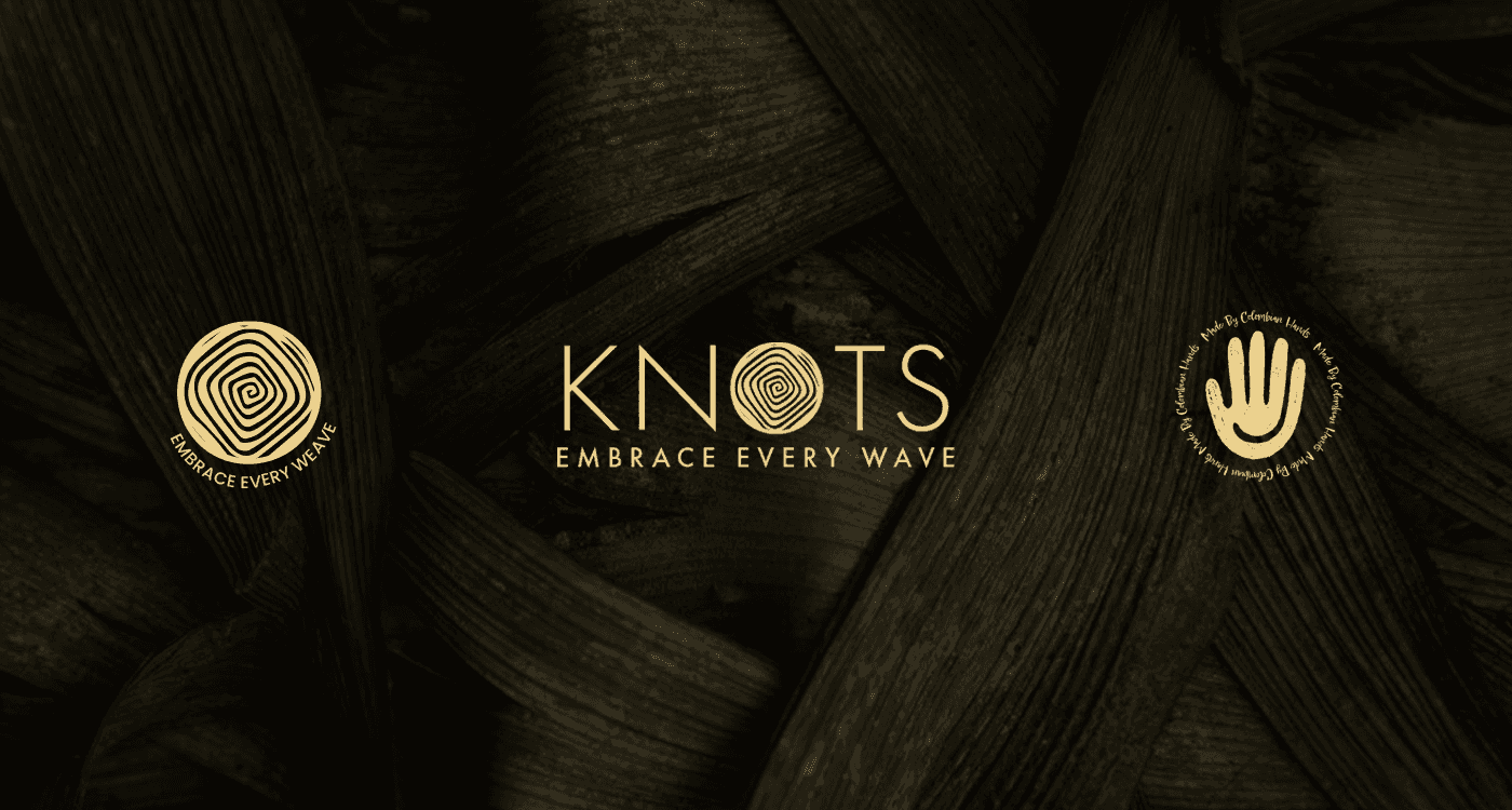
The name came first. The brief didn't provide one, the business was referred to as The Brand X. I proposed Knots because it was directly tied to the craft at the heart of the brand: macramé is the art of creating form through knots. The name is simple, tactile, and immediately connected to what the product actually is. It also works in both English and Spanish without losing meaning. With the name anchored, I built the visual direction from the brand's two cultural pillars. The mark is geometric, clean shapes derived from the precision of the macramé grid, but softened with feminine figures drawn from Andean iconography. The result sits between structure and fluidity, which is exactly where this brand lives. The colour palette was built around neutrals inspired by the brand's commitment to environmental sustainability, warm earth tones that feel like sand, natural fiber, and open water. Nothing that shouts. Everything that resonates. Typography paired Epicursive for its artistic, handcrafted touch with Poppins for clarity and approachability, tradition and accessibility in the same breath. Every touchpoint was designed around the brand ethos: Embrace Every Wave, not just about the ocean, but about welcoming the challenges of building something ethical and slow in a world of fast fashion. Swing tags, shopping bags, gift wrapping, flyers, and signage all carried the same quiet confidence.
Es
El nombre fue primero. El brief no proporcionaba uno, el negocio era referido como The Brand X. Propuse Knots porque estaba directamente vinculado al oficio en el corazón de la marca: el macramé es el arte de crear forma a través de nudos. El nombre es simple, táctil, e inmediatamente conectado con lo que el producto realmente es. También funciona en inglés y español sin perder significado. Con el nombre establecido, construí la dirección visual desde los dos pilares culturales de la marca. El mark es geométrico, formas limpias derivadas de la precisión de la grilla del macramé, pero suavizado con figuras femeninas tomadas de la iconografía andina. El resultado se sitúa entre la estructura y la fluidez, que es exactamente donde vive esta marca. La paleta de colores fue construida alrededor de neutros inspirados en el compromiso de la marca con la sostenibilidad ambiental, tonos tierra cálidos que evocan arena, fibra natural y agua abierta. Nada que grite. Todo que resuene. La tipografía combinó Epicursive por su toque artístico y artesanal con Poppins por su claridad y accesibilidad, tradición y modernidad en el mismo trazo. Cada punto de contacto fue diseñado alrededor del ethos de la marca: Embrace Every Wave, no solo sobre el océano, sino sobre abrazar los desafíos de construir algo ético y lento en un mundo de moda rápida. Swing tags, bolsas, gift wrapping, flyers y señalética llevaban la misma confianza tranquila.


What I
Learned
En
This project taught me how to design for a brand with deep cultural roots without reducing that culture to decoration. The Andean iconography and macramé references had to be present in the system, but they couldn't be the whole story. The brand also needed to speak to a modern Australian audience aged 25-45 who value quality over trend. Finding that balance between cultural authenticity and contemporary appeal was the most demanding and most rewarding part of this project.
Es
Este proyecto me enseñó a diseñar para una marca con raíces culturales profundas sin reducir esa cultura a la decoración. La iconografía andina y las referencias al macramé tenían que estar presentes en el sistema, pero no podían constituir la historia completa. La marca también necesitaba hablar a una audiencia australiana moderna de 25 a 45 años que valora la calidad sobre la tendencia. Encontrar ese equilibrio entre la autenticidad cultural y el atractivo contemporáneo fue la parte más exigente y gratificante de este proyecto.
The
Result
En
A complete brand identity for a sustainable swimwear boutique, named, designed, and applied across every customer touchpoint. A brand that knows exactly where it comes from and exactly who it's for.
Es
Una identidad de marca completa para una boutique de trajes de baño sostenible, nombrada, diseñada y aplicada en cada punto de contacto con el cliente. Una marca que sabe exactamente de dónde viene y exactamente para quién es.


knots
Two cultures, one thread. A swimwear brand built from where it comes from.
(Year)
2023
(Services)
Branding · Visual Identity
(Tools Used)
Adobe Illustrator · Adobe Photoshop · Adobe InDesign
The
Challenge
En
The brief introduced a swimwear boutique with a powerful origin story, a Colombian founder working with indigenous artisans, using handcrafted techniques like macramé, embroidery, and beading to create garments that were both wearable art and a statement about sustainable fashion. The brand needed to bridge two worlds: the vibrant natural landscapes of Colombia and the conscious lifestyle culture of Australia. The challenge was building an identity that could hold craft, cultural heritage, and sustainability without becoming overwhelming, and without falling into the trap of over-decorating a brand that should feel as clean as the ocean it belongs to.
Es
El brief presentaba una boutique de trajes de baño con una historia de origen poderosa, una fundadora colombiana trabajando con artesanos indígenas, usando técnicas artesanales como macramé, bordado y abalorios para crear prendas que fueran tanto arte portátil como una declaración sobre la moda sostenible. La marca necesitaba unir dos mundos: los vibrantes paisajes naturales de Colombia y la cultura de consumo consciente de Australia. El desafío era construir una identidad que pudiera sostener artesanía, herencia cultural y sostenibilidad sin volverse abrumadora, y sin caer en la trampa de sobre-decorar una marca que debería sentirse tan limpia como el océano al que pertenece.
My
roLE
En
Naming, brand strategy, visual identity design, and brand system application across all touchpoints, from swing tags and shopping bags to signage and promotional materials.
Es
Naming, estrategia de marca, diseño de identidad visual y aplicación del sistema de marca en todos los puntos de contacto, desde swing tags y bolsas de compra hasta señalética y materiales promocionales.
The
Process
En
The name came first. The brief didn't provide one, the business was referred to as The Brand X. I proposed Knots because it was directly tied to the craft at the heart of the brand: macramé is the art of creating form through knots. The name is simple, tactile, and immediately connected to what the product actually is. It also works in both English and Spanish without losing meaning. With the name anchored, I built the visual direction from the brand's two cultural pillars. The mark is geometric, clean shapes derived from the precision of the macramé grid, but softened with feminine figures drawn from Andean iconography. The result sits between structure and fluidity, which is exactly where this brand lives. The colour palette was built around neutrals inspired by the brand's commitment to environmental sustainability, warm earth tones that feel like sand, natural fiber, and open water. Nothing that shouts. Everything that resonates. Typography paired Epicursive for its artistic, handcrafted touch with Poppins for clarity and approachability, tradition and accessibility in the same breath. Every touchpoint was designed around the brand ethos: Embrace Every Wave, not just about the ocean, but about welcoming the challenges of building something ethical and slow in a world of fast fashion. Swing tags, shopping bags, gift wrapping, flyers, and signage all carried the same quiet confidence.
Es
El nombre fue primero. El brief no proporcionaba uno, el negocio era referido como The Brand X. Propuse Knots porque estaba directamente vinculado al oficio en el corazón de la marca: el macramé es el arte de crear forma a través de nudos. El nombre es simple, táctil, e inmediatamente conectado con lo que el producto realmente es. También funciona en inglés y español sin perder significado. Con el nombre establecido, construí la dirección visual desde los dos pilares culturales de la marca. El mark es geométrico, formas limpias derivadas de la precisión de la grilla del macramé, pero suavizado con figuras femeninas tomadas de la iconografía andina. El resultado se sitúa entre la estructura y la fluidez, que es exactamente donde vive esta marca. La paleta de colores fue construida alrededor de neutros inspirados en el compromiso de la marca con la sostenibilidad ambiental, tonos tierra cálidos que evocan arena, fibra natural y agua abierta. Nada que grite. Todo que resuene. La tipografía combinó Epicursive por su toque artístico y artesanal con Poppins por su claridad y accesibilidad, tradición y modernidad en el mismo trazo. Cada punto de contacto fue diseñado alrededor del ethos de la marca: Embrace Every Wave, no solo sobre el océano, sino sobre abrazar los desafíos de construir algo ético y lento en un mundo de moda rápida. Swing tags, bolsas, gift wrapping, flyers y señalética llevaban la misma confianza tranquila.
What I
Learned
En
This project taught me how to design for a brand with deep cultural roots without reducing that culture to decoration. The Andean iconography and macramé references had to be present in the system, but they couldn't be the whole story. The brand also needed to speak to a modern Australian audience aged 25-45 who value quality over trend. Finding that balance between cultural authenticity and contemporary appeal was the most demanding and most rewarding part of this project.
Es
Este proyecto me enseñó a diseñar para una marca con raíces culturales profundas sin reducir esa cultura a la decoración. La iconografía andina y las referencias al macramé tenían que estar presentes en el sistema, pero no podían constituir la historia completa. La marca también necesitaba hablar a una audiencia australiana moderna de 25 a 45 años que valora la calidad sobre la tendencia. Encontrar ese equilibrio entre la autenticidad cultural y el atractivo contemporáneo fue la parte más exigente y gratificante de este proyecto.
The
Result
En
A complete brand identity for a sustainable swimwear boutique, named, designed, and applied across every customer touchpoint. A brand that knows exactly where it comes from and exactly who it's for.
Es
Una identidad de marca completa para una boutique de trajes de baño sostenible, nombrada, diseñada y aplicada en cada punto de contacto con el cliente. Una marca que sabe exactamente de dónde viene y exactamente para quién es.