NH CARE
Web Design
A rebrand means nothing if the website still looks like the old one.
(Tools Used)
Figma · Adobe Illustrator · Adobe Photoshop


The
Challenge
En
NH Care is a Perth-based community services organisation that had recently gone through a rebrand. The new visual identity existed, but the website didn't reflect it. The site was live, functional, and completely out of sync with who the organisation had become. The audience made this project particularly demanding: older adults with low tech confidence, and carers navigating stressful, high-stakes decisions about the people they love. Every design decision had to earn its place. There was no room for confusion, visual noise, or anything that made the experience harder than it needed to be.
Es
NH Care es una organización de servicios comunitarios en Perth que recientemente había pasado por un rebranding. La nueva identidad visual existía, pero el sitio web no la reflejaba. El sitio estaba vivo, funcional, y completamente desincronizado con quién se había convertido la organización. La audiencia hizo este proyecto particularmente exigente: adultos mayores con poca confianza tecnológica, y cuidadores navegando decisiones estresantes y de alto impacto sobre las personas que aman. Cada decisión de diseño tenía que justificarse. No había espacio para confusión, ruido visual, ni nada que hiciera la experiencia más difícil de lo necesario.

My
roLE
En
UX research, competitor analysis, user surveys, prototyping, and UI design. I worked embedded within the marketing team, collaborating on content strategy while owning the design entirely.
Es
Research de UX, análisis de competencia, encuestas a usuarios, prototipado y diseño de UI. Trabajé integrada dentro del equipo de marketing, colaborando en la estrategia de contenido mientras era responsable del diseño por completo.

The
Process
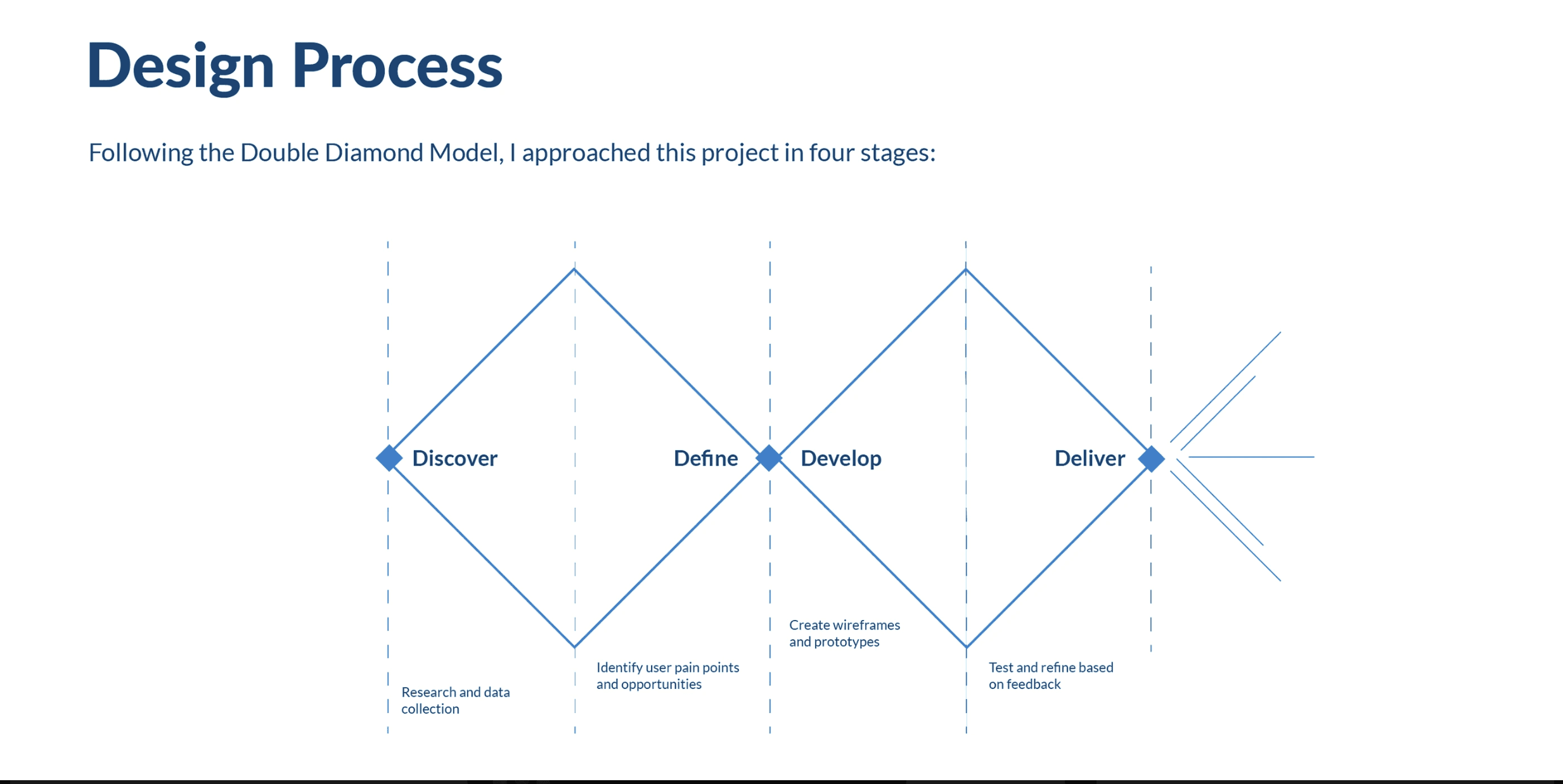
En
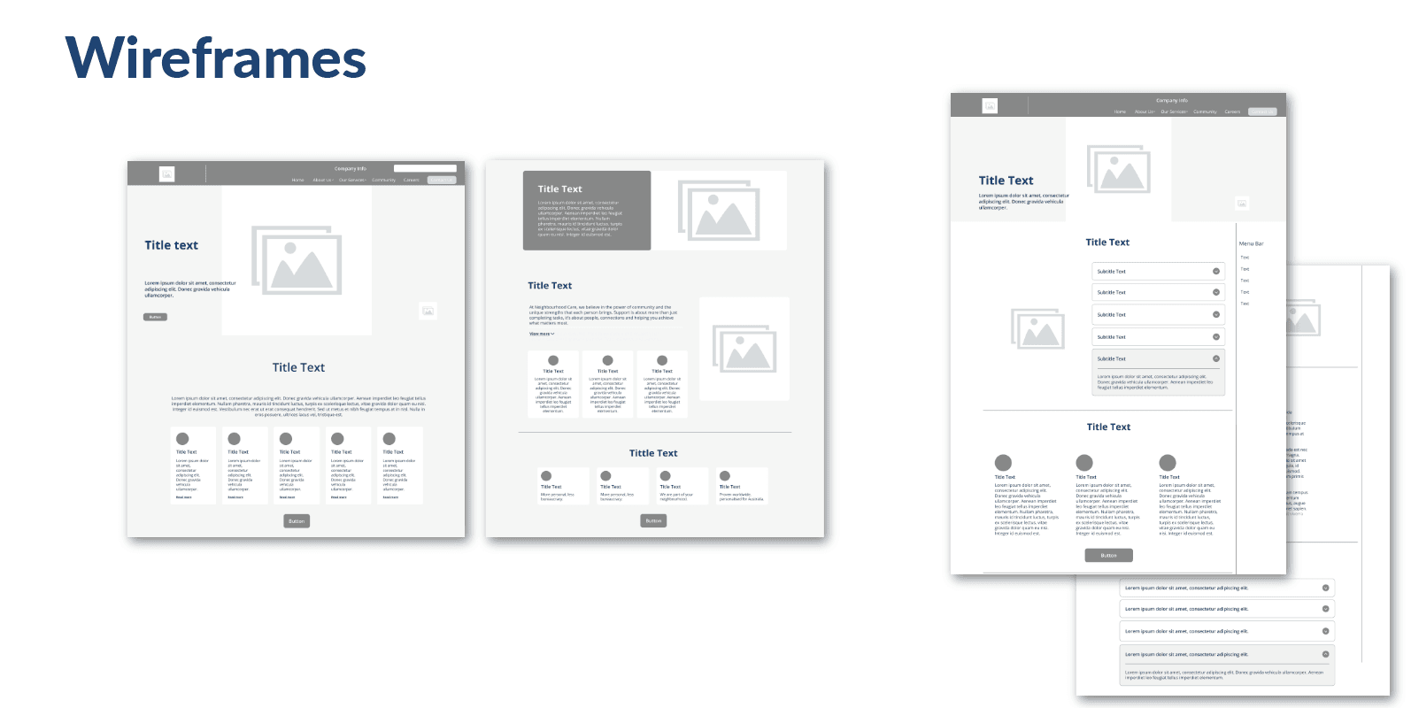
I started where every web project should start, with the people who were going to use it. I ran surveys with existing NH Care clients to understand what they needed from the site and what frustrated them about the current one. The feedback was consistent: too much text, unclear navigation, and no sense of what services were actually available. In parallel, I conducted a competitor analysis, identifying the strongest examples of community services websites in Australia and presenting them to the marketing team. That research shaped a shared understanding of what sections to keep, what to cut, and what to completely reimagine. From there I built a section-by-section prototype in Figma. Every decision was made with the same user in mind: someone who may not be comfortable with technology, who is likely stressed, and who needs to find what they're looking for without having to think too hard. That meant clean navigation, generous white space, deliberate color use, and copy that didn't assume any prior knowledge. The rebrand's visual system was applied consistently throughout, colours, typography, imagery direction, so that for the first time, the website and the brand felt like the same organisation.
Es
Empecé donde todo proyecto web debería empezar, con las personas que lo iban a usar. Realicé encuestas a clientes existentes de NH Care para entender qué necesitaban del sitio y qué les frustraba del actual. El feedback fue consistente: demasiado texto, navegación confusa, y ninguna claridad sobre qué servicios estaban disponibles. En paralelo, hice un análisis de competencia, identificando los mejores ejemplos de sitios web de servicios comunitarios en Australia y presentándolos al equipo de marketing. Ese research construyó un entendimiento compartido de qué secciones conservar, qué eliminar, y qué reimaginar completamente. Desde ahí construí un prototipo sección por sección en Figma. Cada decisión fue tomada con el mismo usuario en mente: alguien que puede no sentirse cómodo con la tecnología, que probablemente está estresado, y que necesita encontrar lo que busca sin tener que pensar demasiado. Eso significó navegación limpia, espacio generoso, uso deliberado del color, y copy que no asumía ningún conocimiento previo. El sistema visual del rebranding fue aplicado de forma consistente, colores, tipografía, dirección de imágenes, para que por primera vez el sitio web y la marca se sintieran como la misma organización.


What I
Learned
En
This was my first professional web project, and it taught me something I carry into every project since: the gap between what a client wants and what a user needs is real, and navigating it requires both research and patience. I also learned the limits of designing inside a team, the final implementation reflected some compromises on content and imagery that weren't part of the original design. That experience shaped how I work with clients now: I document decisions, communicate rationale, and make sure the handoff is as clear as the design.
Es
Este fue mi primer proyecto web profesional, y me enseñó algo que llevo a cada proyecto desde entonces: la brecha entre lo que un cliente quiere y lo que un usuario necesita es real, y navegarla requiere tanto research como paciencia. También aprendí los límites de diseñar dentro de un equipo, la implementación final reflejó algunos compromisos en contenido e imágenes que no eran parte del diseño original. Esa experiencia moldeó cómo trabajo con clientes ahora: documento decisiones, comunico el razonamiento, y me aseguro de que el handoff sea tan claro como el diseño.
The
Result
En
A redesigned website live at nhcare.com.au, with cleaner navigation, a visual system aligned with the rebrand, and a structure built around what users actually needed to find. The change from the original site was significant. For the first time, the organisation's digital presence reflected its values.
Es
Un sitio web rediseñado vivo en nhcare.com.au, con navegación más limpia, un sistema visual alineado con el rebranding, y una estructura construida alrededor de lo que los usuarios realmente necesitaban encontrar. El cambio respecto al sitio original fue significativo. Por primera vez, la presencia digital de la organización reflejaba sus valores.
NH CARE
Web Design
A rebrand means nothing if the website still looks like the old one.
(Tools Used)
Figma · Adobe Illustrator · Adobe Photoshop
The
Challenge
En
NH Care is a Perth-based community services organisation that had recently gone through a rebrand. The new visual identity existed, but the website didn't reflect it. The site was live, functional, and completely out of sync with who the organisation had become. The audience made this project particularly demanding: older adults with low tech confidence, and carers navigating stressful, high-stakes decisions about the people they love. Every design decision had to earn its place. There was no room for confusion, visual noise, or anything that made the experience harder than it needed to be.
Es
NH Care es una organización de servicios comunitarios en Perth que recientemente había pasado por un rebranding. La nueva identidad visual existía, pero el sitio web no la reflejaba. El sitio estaba vivo, funcional, y completamente desincronizado con quién se había convertido la organización. La audiencia hizo este proyecto particularmente exigente: adultos mayores con poca confianza tecnológica, y cuidadores navegando decisiones estresantes y de alto impacto sobre las personas que aman. Cada decisión de diseño tenía que justificarse. No había espacio para confusión, ruido visual, ni nada que hiciera la experiencia más difícil de lo necesario.
My
roLE
En
UX research, competitor analysis, user surveys, prototyping, and UI design. I worked embedded within the marketing team, collaborating on content strategy while owning the design entirely.
Es
Research de UX, análisis de competencia, encuestas a usuarios, prototipado y diseño de UI. Trabajé integrada dentro del equipo de marketing, colaborando en la estrategia de contenido mientras era responsable del diseño por completo.
The
Process
En
I started where every web project should start, with the people who were going to use it. I ran surveys with existing NH Care clients to understand what they needed from the site and what frustrated them about the current one. The feedback was consistent: too much text, unclear navigation, and no sense of what services were actually available. In parallel, I conducted a competitor analysis, identifying the strongest examples of community services websites in Australia and presenting them to the marketing team. That research shaped a shared understanding of what sections to keep, what to cut, and what to completely reimagine. From there I built a section-by-section prototype in Figma. Every decision was made with the same user in mind: someone who may not be comfortable with technology, who is likely stressed, and who needs to find what they're looking for without having to think too hard. That meant clean navigation, generous white space, deliberate color use, and copy that didn't assume any prior knowledge. The rebrand's visual system was applied consistently throughout, colours, typography, imagery direction, so that for the first time, the website and the brand felt like the same organisation.
Es
Empecé donde todo proyecto web debería empezar, con las personas que lo iban a usar. Realicé encuestas a clientes existentes de NH Care para entender qué necesitaban del sitio y qué les frustraba del actual. El feedback fue consistente: demasiado texto, navegación confusa, y ninguna claridad sobre qué servicios estaban disponibles. En paralelo, hice un análisis de competencia, identificando los mejores ejemplos de sitios web de servicios comunitarios en Australia y presentándolos al equipo de marketing. Ese research construyó un entendimiento compartido de qué secciones conservar, qué eliminar, y qué reimaginar completamente. Desde ahí construí un prototipo sección por sección en Figma. Cada decisión fue tomada con el mismo usuario en mente: alguien que puede no sentirse cómodo con la tecnología, que probablemente está estresado, y que necesita encontrar lo que busca sin tener que pensar demasiado. Eso significó navegación limpia, espacio generoso, uso deliberado del color, y copy que no asumía ningún conocimiento previo. El sistema visual del rebranding fue aplicado de forma consistente, colores, tipografía, dirección de imágenes, para que por primera vez el sitio web y la marca se sintieran como la misma organización.
What I
Learned
En
This was my first professional web project, and it taught me something I carry into every project since: the gap between what a client wants and what a user needs is real, and navigating it requires both research and patience. I also learned the limits of designing inside a team, the final implementation reflected some compromises on content and imagery that weren't part of the original design. That experience shaped how I work with clients now: I document decisions, communicate rationale, and make sure the handoff is as clear as the design.
Es
Este fue mi primer proyecto web profesional, y me enseñó algo que llevo a cada proyecto desde entonces: la brecha entre lo que un cliente quiere y lo que un usuario necesita es real, y navegarla requiere tanto research como paciencia. También aprendí los límites de diseñar dentro de un equipo, la implementación final reflejó algunos compromisos en contenido e imágenes que no eran parte del diseño original. Esa experiencia moldeó cómo trabajo con clientes ahora: documento decisiones, comunico el razonamiento, y me aseguro de que el handoff sea tan claro como el diseño.
The
Result
En
A redesigned website live at nhcare.com.au, with cleaner navigation, a visual system aligned with the rebrand, and a structure built around what users actually needed to find. The change from the original site was significant. For the first time, the organisation's digital presence reflected its values.
Es
Un sitio web rediseñado vivo en nhcare.com.au, con navegación más limpia, un sistema visual alineado con el rebranding, y una estructura construida alrededor de lo que los usuarios realmente necesitaban encontrar. El cambio respecto al sitio original fue significativo. Por primera vez, la presencia digital de la organización reflejaba sus valores.